Monday, February 21, 2011

Navigation Bar

 Navigation Bar

Real Simple uses pull down menus for their navigation bar. I think it is pretty self-explanatory and simple to use. Now that I am getting more accustomed with the website I can easily go straight to what I want and find what I'm looking for without much thought.

Pull-down Menu

Most of the content is categorized by subject matter within the department. Once the user clicks on a subject in the navigation bar the site takes him or her to a page that is templated the same way. There is a large feature with a photo and blurb explaining the topic and underneath are smaller stories in the same category. The reader can organize the subject matter by most popular and most recent.

The navigation bar appeals to the person who doesn't come to the website very often. Real Simple doesn't assume that all people who visit the website are subscribers, which is great for casual visitors.

The drawback of their navigation bar is that it can be hard to find the latest content. Most of the stuff that pops up are the most popular stories, but overall Real Simple does a good job of organizing their stories.

Monday, February 14, 2011

New Daily Content Item

There are many different aspects on realsimple.com that refresh daily. The Daily Find is a section online that is complete service journalism. Each day Real Simple gives relevant information to the reader, the topics span from the "Best Kitchen Trash Bags" to today's topic, the "5 Grooming Gifts For Him." 

The Daily Find 2/14/2011

This is a great section for online because it does change daily and can be relevant for holidays and themes that the print publication might not be able to fit into print or isn't timely for the print version. This is also great because readers are able to browse through the many Daily Find archives. 

The drawback of this section is that I cannot tell if these are recycled ideas from past Daily Finds that previously ran or if they are unique ideas every day. The Daily Finds are not dated, so there is no way to know the uniqueness unless you are a frequent observer of the website. From what I can tell, since the beginning of the semester each Daily Find has been new each day. There is also a newsletter that accompanies this section. I have signed up for it and will update with information about how the two complement each other once I begin receiving the newsletters.

Friday, February 4, 2011

Web Only Multimedia Piece

Real Simple does not have a multimedia tab on the website that holds videos or web-only pieces in one place. The reader has to look for multimedia interspersed throughout the site. However, each main section of the site has some sort of multimedia piece associated with it. Real Simple does a great job of incorporating new information that is different from the print publication on their website.

After looking through a few different videos, I came across an interactive beauty makeover tool. The way the tool works is that a reader must upload a mug of him or heself to the site, then after thumbing through a variety of different options for hairstyle and makeup choices the user will need to select the best fit for his or her style. A list of the products that the user picked throughout the makeover process will appear as a sidebar. The ending result is completely new look that the user can recreate. 

This type of multimedia piece is interactive for the reader and is used as a supplement to Real Simple's Beauty and Fashion section. Although this tool doesn't necessarily give an accurate portrayal of what one would actually look like with different makeup or a different hairstyle, it does get readers involved and active on the site. Below are some screen shots of the tool and my ending makeover result. As a side note, I just want to say that I was only experimenting with the tool not actually trying to make myself look better.
Splash Page for the tool


Opening page of tool

My end result

Sunday, January 30, 2011

Print Headlines to Web Headlines

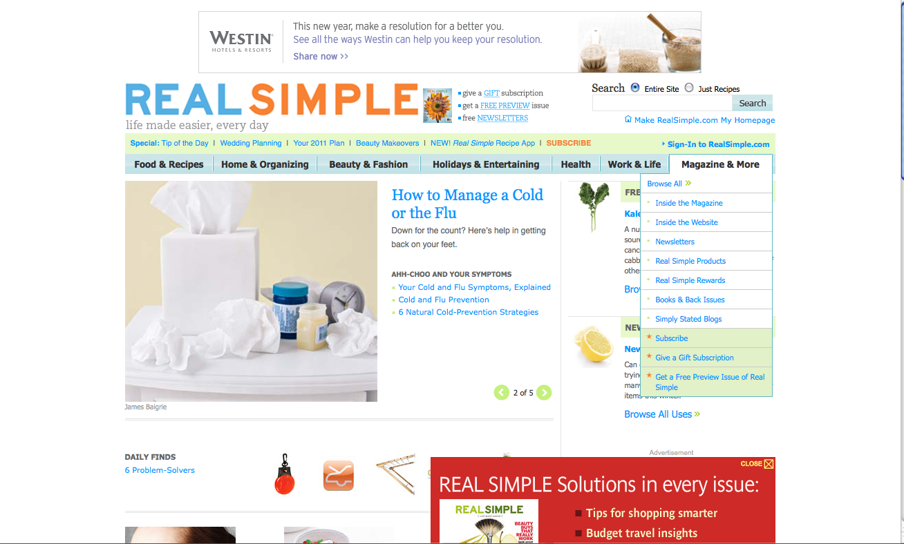
It is somewhat difficult to find the articles in the print magazine on Real Simple's website. I had to actually search through the search bar to find the some of the articles. They are buried pretty deep within the site. On the homepage of the site there is a rotating story module that only covers a few of the stories shown in the print publication. However, a pro for not having all the print items on the homepage is that Real Simple fills the rest of the page with daily updates. This is a big plus because it gives me a reason to come back everyday.  A con for not having all the stories on the main page is that it makes it harder to find the story if for some reason I want to recall an article but don't have my magazine with me.

However, the articles that I did find retained the same headline for print and for the web. It only makes sense because the print headlines are written perfectly for the web. Much of Real Simple is service journalism, so the print headlines tell exactly what the reader will be learning. The two examples below show this.
Screenshot of "The Best Tinted Moisturizers" (same headline in print).

Screenshot of "15-Minute Jump-Rope Workout" (same headline in print).

The big feature story this month in the print magazine was called "Your New Healthy Eating Plan." It had a bunch of healthy food options and recipes for the reader to try. I searched for this article on the website and found that it changed the headline to actually reflect the the print cover headline plus the print feature headline.
Cover of the February issue: "You're No-Diet Diet for 2011."

Screenshot of feature print story online. This headline combines the print cover line and the print headline.

However, this article was packaged completely differently. It had new information and linked to more information about the same topic. Some of the links went to information that can be found in the print version.  This information was packaged the same way as the print publication.

Real Simple is an interesting publication in that there are so many differences between the platforms. I'm still trying to learn my way around the website and magazine. I think as the weeks progress I will be able to find more similarities and differences between the two platforms.

Web Refers and Online-Exclusive Content

EDITORS NOTE: On February 25, 2011, I had a chance to visit Real Simple (dream come true). I specifically asked why Real Simple does not have a lot of web promotion in their print publication and Jackie Monk, Deputy Managing Editor, said that Real Simple readers don't want to get up from the magazine to check out links online when reading Real Simple in print. In the last graph of this post I noted that I thought this might be the case. 

Interestingly enough, Real Simple has slim-to-none web refers and online-only teasers in their print publication. The only refers to the web that I saw were in the beginning of the magazine that asked readers to go to the website to submit their answers for next month's questions about books and cleaning products. However, these refers to the web are in what looks like 9 -point- font, and at the end of each article. They do not stand out at all.

Screenshot of "Inside the Magazine" tab.

On the website under the "Inside the Magazine" tab, the feature that is displayed asks readers to submit their answers for what their favorite cleaning product is and what gets them out of a bad mood. These questions are mentioned in the print publication and are two of the three web refers that I found in the magazine.

I think it is very interesting that Real Simple doesn't do more refers or have icons and pages devoted to promoting the website. As far as I can tell the online platform has a lot of different content compared to what Real Simple puts out in their print platform. I would think that the readers of Real Simple would want to know this, and I would also think that Real Simple would want to promote their web platform because it is so different from the magazine. The content on the website changes daily and gives readers a reason to come back each day, unlike the monthly publication that only gives readers fresh ideas once a month.

I'm not sure why the company doesn't promote their cross-platform options in the print publication, but from the design elements in the magazine I feel that Real Simple is exactly what their title infers it to be. It is designed simply and beautifully, without clutter and has a lot of white space. Maybe the company feels that icons and web refers would add clutter to the pages and not stay true to the brand they are trying to build.

Friday, January 21, 2011

Explanation of Project

Screenshot of Real Simple website

This semester I have chosen to analyze Real Simple magazine's print publication and web platform. For the next few months I will purchase the magazine and check the site to monitor changes and find interesting multimedia elements. I feel that this magazine has a lot to offer on both sides.

On Real Simple's site they have a tab that gives an overview of the site and a tab that gives an overview of the publication. I plan to pay special attention to these areas of the site every week to see how often a monthly publication switches up their web content. The screen shot above is of their Web Site, and shows the tabs I mentioned.

I hope to find out pertinent information this semester about social media strategies implemented by this publication and how Real Simple is adapting to such a web-centric world.