After analyzing Real Simple this semester, I have noticed that the web component of the magazine tries to differentiate itself from the print publication. Much of the content on the website is unique and offers a truly interactive experience.
The navigation and art on the entire site fits with the experience of the Real Simple brand. The website isn't too crazy or filled with a bunch of advertising. This makes the user's browsing experience that much better. This type of feeling is carried out through the social media pages. Each platform feels connected. Real Simple also takes advantage of everything the web offers. They utilize video, audio and database searches.
Areas that could use more attention on the site are the sub pages. Some of the content on those pages can become stale. They often use the same art for months at a time and most of the stories don't have dates. This makes new users feel like the content is still fresh, but after revisiting the site for months at a time it became old and felt dated. Maybe expanding the online staff could help solve some of these problems. The man power to constantly keep a website maintained is huge, and requires the help of multiple people.
Some of the best stuff on realsimple.com was on the blog. This never got old and was constantly being updated. I was happy that this was something I could look forward to reading each day of the week. The amount of work that goes into making sure a blog is updated is extreme and I appreciate the effort it takes to keep the blog fresh.
Overall, the site does a great job of keeping readers interested and in-the-know. It will be interesting to see if any of the improvements I noticed will be addressed in the future.
Tuesday, May 10, 2011
Wednesday, April 27, 2011
Posts from our partners
On the home page of the Real Simple site, there is a section devoted to posts from our partners. It's called "New on the Web."
 I think it's interesting that the magazine chooses to display other content from outside the publication so prominently on their website. I know other publications do this, but usually this type of feed is at the bottom of the site and it generally only gives the domain name. I haven't seen very many that display an RSS feed like this. At the bottom of Lemondrop.com they have a blogroll that is essentially the same thing as Real Simple's "New on the Web" section, however, like I said above, it's at the bottom of the site.

Wednesday, April 20, 2011
A-Z Ingredient Guide

O ingredients
The A-Z Ingredient Guide is one piece of online exclusive content that seems very valuable to the website. It tells the reader some information about commonly used ingredients and gives recipes that suit these items. Not only are their recipes, but some of the ingredients also have video that accompanies the stories. The videos can range from the proper way to cut an onion to how to zest citrus. There are even quick tips on the best way to store to buy the food.
The best part of this database is that has so many different pieces of information. The content is useful and it's all located in one place. It could take hours to find something like this in such an organized fashion, but Real Simple puts everything together in such a way that is easy to find information quickly and efficiently.
They even have a newsletter that will show you how to find fresh ingredients in your area. They are really trying to put together a site that can work for everyone, no matter where the reader is located.
New Uses for Old Things
I love this part of the website. Real Simple gives readers some ideas for new, practical uses for old things that most people don't know what to do with. This content is always fresh and useful. What I like best about how this is displayed online is that I can see new content everyday and I can also search archived material.

The best part of today's new uses is that it is seasonal and timely. The site always does a good job of incorporating information that is relevant to their existing departments and recurring sections.

Easter egg new uses
The best part of today's new uses is that it is seasonal and timely. The site always does a good job of incorporating information that is relevant to their existing departments and recurring sections.
Updating the website

Inside the Magazine photo
There are some parts of Real Simple's website that seem to never get updated. For example, under the Inside the Magazine tab there is a photograph of a women writing notes. This picture has been the same since I started looking at Real Simple's website back in January. The content changes each month, but nothing ever happens with the art. Frankly, it's boring to come back to a website every week and see the same photo living in the same place for months. The magazine does a good job of maintaining their home page, but a suggestion would be to put that same amount of man power into switching out art throughout the entire site. Every section opening should be treated with the same amount of importance as the home page.

Featured story in the clothing section
Another area that doesn't seem to be updated as often is the clothing section. The above feature story has been on this page for at least a month, if not more. I'm not sure if I've ever seen it change. Real Simple's website is made up of many layers. It has so many pages and openers that I know it must be hard to keep up with the workload. Especially since they have a lot of online exclusive stories. However, it's important to readers that information gets updated and changed on a regular basis. I hope that I will begin to see more updates to the site in the next month.
Wednesday, April 13, 2011
Real Simple Asks

This is a great example of user-generated content that is unique to the website. The interesting part about these questions is that they are archived and people can comment on them for as long as they are searchable. When looking through some of the older questions, it is easy to see that a lot of the comment givers are frequent users of the site. They often comment on more than one question. This shows that their really is a niche for this kind of stuff. People like to talk about themselves and tell their stories to the world.
Readers can also click on the comment givers profile and see what their recent activity on Real Simple has been. Most of the people I looked at primarily stick to the questions section. This type of engaging media is something that can help foster a small audience.
Contests and Sweepstakes
One tactic that we talked about in class in regards to interaction between a companies audience and their website is using contests. Real Simple is giving away different kits and books in reward for participating in the "The Great Easter Egg Hunt Sweepstakes."
From April 11- April 24 readers can go on realsimple.com to find an easter egg somewhere on the site. There is a clue given everyday to where the egg is, and once you find the egg you can click on it and enter to win one of the four prizes.


From April 11- April 24 readers can go on realsimple.com to find an easter egg somewhere on the site. There is a clue given everyday to where the egg is, and once you find the egg you can click on it and enter to win one of the four prizes.

prizes for winning
This type of involvement with the reader is fun and gets people inside the site. I searched for the egg after reading the clue: The egg is taking a break inside a 20-minute workout.

And look what I found! I clicked on it and it took me to an entry form. This type of game has a time peg because of Easter. It works well and is a game that gets people trolling around the site everyday.
No Time to Cook App
Real Simple came out with an iPad, iPhone and Android app that is for people who needto create meals during the week in a hurry. It's called No Time to Cook and it was released around December 2010. It was re-released on April 13, 2011 to version 1.0.3

The reason behind the new launch was because so many people who downloaded the app said that for the $4.99 price tag they expected less ads and more functionality. According to Real Simple this app is supposed to deliver this.
 However, after reading comments from users they haven't really since a decrease in the amount of ads. Some even believe that because it's a paid app that it should be ad-free. This is something that I think many app developers are dealing with when it comes to app building. When should ads be used and when should apps be totally ad-free.
On another note, the branding of the application is done very well. It matches the tone and feel of the magazine. The colors and typography are consistent through all of Real Simple's products.

Screenshot of the app on the iPad and iPhone
The reason behind the new launch was because so many people who downloaded the app said that for the $4.99 price tag they expected less ads and more functionality. According to Real Simple this app is supposed to deliver this.

On another note, the branding of the application is done very well. It matches the tone and feel of the magazine. The colors and typography are consistent through all of Real Simple's products.
Wednesday, April 6, 2011
Twitter Presence

Twitter account
Real Simple (@Real_Simple) is on Twitter, and it looks like they've been on the site for quite awhile now. The magazine does a great job branding themselves and distinguishing their brand from others. The colors are always consistent, the design is always beautifully done. Nothing is over-the-top or loud.
Right now, Real Simple has 171,804 followers on Twitter and 2, 243 tweets. The amount of tweets compares to what Vox Magazine has at 2, 590 tweets. Real Simple's twitter presence is there. They don't spam people's accounts, but they balance their content promotion with their ability to engage with the community. It's a brilliant plan and by the looks of the tweets it seems to be working.

Tweets with the community.
On top of their magazine twitter presence, Real Simple also holds accounts for their food (@RealSimpleFood) and special offers (@RS_Offers). The other two accounts don't get as much play as the main twitter account, which is understandable because there won't always be as many food tips or offers for the readers. Overall, I think Real Simple has their Twitter presence down pretty well. At least from what I've seen today.
Simple Stated Blog
The Real Simple blog.
Real Simple has a very active blog presence. Their blog Simply Stated. is updated frequently. It looks like it takes a break on the weekends, but posts are constantly being put up on the site everyday. Usually there are multiple posts in one day. I think it's interesting that the blog goes dead on the weekends though. I'm not sure what the statistics are on the weekend traffic to their blog, but it seems like a big risk to only maintain it Monday-Friday. However, no where on the site does it say it is a daily blog, so maybe they only want it to be a weekday stopping point.
The posts are spread out at different times throughout the day. This gives readers an incentive to come back and visit the blog more than once a day. It looks like posts will go out as early as 8 a.m. to as late as 7 p.m. I'm sure what the strategy is behind the times, but it works because nothing is going up within minutes of something else.
Something that I like about their blog is that when an editor makes a blog post their picture is right next to the title of the post. This brings a human aspect to the blogger. I think seeing the picture of the person who is blogging makes the reader feel more connected to the subject matter and shows that even in the far-off land of New York City that real people are still writing these blog posts and that they still do exist.
One of the down-falls of the blog is that is doesn't seem like it's promoted enough. I had no idea it was a blog until I clicked on it. On the homepage of Real Simple there is spot where it lives. It only says "Simple Stated. : Daily Tips from our Editors and Experts." I would have been more inclined to click on the link earlier had I known that it was a blog. They should consider making that more clear on the homepage somehow. If they included it in the masthead of the blog title on the homepage, instead of the "Daily Tips from our Editors and Experts" I think it would be much more clear that it's a blog and not just another area on the site that offers daily tips like the "Daily Finds."

What the blog looks like on the homepage of Real Simple.
Advertisements
One of the nice things about Real Simple's website is that it doesn't have an overload of ads popping out at you as you scroll through the site. Most of the advertisements live on the right side of the site. They aren't distracting and they don't over power the entire page.


Advertisement on the right rail.
Real Simple only has one pop-up ad that appears when you open the site. It occurs when your first visit the home page. It's generally an in-house ad that promotes a subscription to the magazine. The good thing about this is it's easy to close out of the ad quickly. The downside of these types of ads is that they are annoying. I know advertising is what keeps most businesses running next to newsstand sales, but pop-up ads ad nothing to content of the site and discourage readers from wanting to visit more often. Generally, I don't even read what these pop-ups say and especially since this is an in-house ad Real Simple could easily nix the ad to create a better user experience.
Another area with ads is above the navigation bar. This is a hot spot for advertisements. Most of these ads are flash graphics and promote products that Real Simple would write about.
Advertiement above the navigation.
The last place that I found ads was when they were interspersed throughout galley-like stories. I was flipping through the Daily Finds of "The Best Reusable Bags" and within the story was an ad for Clorox. I've seen ads placed like this before and it's second nature for me to just flip right past it. These types of ads are also annoying, but I know they probably create a good amount of revenue. However, the interesting thing about this ad is that it promotes Real Simple on Twitter and the Clorox product. This sort of advertising technique is a great way to boost sales for the product and drive traffic to Real Simple's Twitter account.

Ad within the story for "The Best Reusable Bags."
Overall, the amount of ads on Real Simple's page is fairly low compared to a lot of the other sites. They don't junk up their page with unnecessary flash graphics that would take away from the feeling a reader gets when reading the magazine or browsing the site.
Thursday, March 24, 2011
Video Strategy
This week I looked at the video strategy on Real Simple's website. Like I mentioned in an earlier post about multimedia there are usually videos hidden throughout the website. It just depends on what sections you're looking at. For the most part, the video is service journalism pieces. From what I've seen there are only how-to videos, which makes sense because this reaches the target audience and personality of the magazine.
They don't promote their videos on their site and I don't often see many tweets to their videos, but this might be because they don't do them that often. The first video that pops up when I search for video is from May 5, 2010. This video is under the most recent tab. However, it's hard to say when these videos went up on the site because they aren't dated. I have no idea how many videos they put up in a week.
For the most part the videos last about a minute to a minute-and-a-half. This is the usual time frame for videos.

This video was under the most recent tab. It is 54 seconds.
Date of most recent comment for above video.
Monday, February 21, 2011
Navigation Bar

Navigation Bar
Real Simple uses pull down menus for their navigation bar. I think it is pretty self-explanatory and simple to use. Now that I am getting more accustomed with the website I can easily go straight to what I want and find what I'm looking for without much thought.

Pull-down Menu
Most of the content is categorized by subject matter within the department. Once the user clicks on a subject in the navigation bar the site takes him or her to a page that is templated the same way. There is a large feature with a photo and blurb explaining the topic and underneath are smaller stories in the same category. The reader can organize the subject matter by most popular and most recent.
The navigation bar appeals to the person who doesn't come to the website very often. Real Simple doesn't assume that all people who visit the website are subscribers, which is great for casual visitors.
The drawback of their navigation bar is that it can be hard to find the latest content. Most of the stuff that pops up are the most popular stories, but overall Real Simple does a good job of organizing their stories.
Monday, February 14, 2011
New Daily Content Item
There are many different aspects on realsimple.com that refresh daily. The Daily Find is a section online that is complete service journalism. Each day Real Simple gives relevant information to the reader, the topics span from the "Best Kitchen Trash Bags" to today's topic, the "5 Grooming Gifts For Him."


The Daily Find 2/14/2011
This is a great section for online because it does change daily and can be relevant for holidays and themes that the print publication might not be able to fit into print or isn't timely for the print version. This is also great because readers are able to browse through the many Daily Find archives.
The drawback of this section is that I cannot tell if these are recycled ideas from past Daily Finds that previously ran or if they are unique ideas every day. The Daily Finds are not dated, so there is no way to know the uniqueness unless you are a frequent observer of the website. From what I can tell, since the beginning of the semester each Daily Find has been new each day. There is also a newsletter that accompanies this section. I have signed up for it and will update with information about how the two complement each other once I begin receiving the newsletters.
Friday, February 4, 2011
Web Only Multimedia Piece
Real Simple does not have a multimedia tab on the website that holds videos or web-only pieces in one place. The reader has to look for multimedia interspersed throughout the site. However, each main section of the site has some sort of multimedia piece associated with it. Real Simple does a great job of incorporating new information that is different from the print publication on their website.
After looking through a few different videos, I came across an interactive beauty makeover tool. The way the tool works is that a reader must upload a mug of him or heself to the site, then after thumbing through a variety of different options for hairstyle and makeup choices the user will need to select the best fit for his or her style. A list of the products that the user picked throughout the makeover process will appear as a sidebar. The ending result is completely new look that the user can recreate.
This type of multimedia piece is interactive for the reader and is used as a supplement to Real Simple's Beauty and Fashion section. Although this tool doesn't necessarily give an accurate portrayal of what one would actually look like with different makeup or a different hairstyle, it does get readers involved and active on the site. Below are some screen shots of the tool and my ending makeover result. As a side note, I just want to say that I was only experimenting with the tool not actually trying to make myself look better.

Splash Page for the tool

Opening page of tool

My end result
Sunday, January 30, 2011
Print Headlines to Web Headlines
It is somewhat difficult to find the articles in the print magazine on Real Simple's website. I had to actually search through the search bar to find the some of the articles. They are buried pretty deep within the site. On the homepage of the site there is a rotating story module that only covers a few of the stories shown in the print publication. However, a pro for not having all the print items on the homepage is that Real Simple fills the rest of the page with daily updates. This is a big plus because it gives me a reason to come back everyday. A con for not having all the stories on the main page is that it makes it harder to find the story if for some reason I want to recall an article but don't have my magazine with me.
However, the articles that I did find retained the same headline for print and for the web. It only makes sense because the print headlines are written perfectly for the web. Much of Real Simple is service journalism, so the print headlines tell exactly what the reader will be learning. The two examples below show this.

The big feature story this month in the print magazine was called "Your New Healthy Eating Plan." It had a bunch of healthy food options and recipes for the reader to try. I searched for this article on the website and found that it changed the headline to actually reflect the the print cover headline plus the print feature headline.


However, this article was packaged completely differently. It had new information and linked to more information about the same topic. Some of the links went to information that can be found in the print version. This information was packaged the same way as the print publication.
Real Simple is an interesting publication in that there are so many differences between the platforms. I'm still trying to learn my way around the website and magazine. I think as the weeks progress I will be able to find more similarities and differences between the two platforms.
However, the articles that I did find retained the same headline for print and for the web. It only makes sense because the print headlines are written perfectly for the web. Much of Real Simple is service journalism, so the print headlines tell exactly what the reader will be learning. The two examples below show this.

Screenshot of "The Best Tinted Moisturizers" (same headline in print).

Screenshot of "15-Minute Jump-Rope Workout" (same headline in print).
The big feature story this month in the print magazine was called "Your New Healthy Eating Plan." It had a bunch of healthy food options and recipes for the reader to try. I searched for this article on the website and found that it changed the headline to actually reflect the the print cover headline plus the print feature headline.

Cover of the February issue: "You're No-Diet Diet for 2011."

Screenshot of feature print story online. This headline combines the print cover line and the print headline.
However, this article was packaged completely differently. It had new information and linked to more information about the same topic. Some of the links went to information that can be found in the print version. This information was packaged the same way as the print publication.
Real Simple is an interesting publication in that there are so many differences between the platforms. I'm still trying to learn my way around the website and magazine. I think as the weeks progress I will be able to find more similarities and differences between the two platforms.
Web Refers and Online-Exclusive Content
EDITORS NOTE: On February 25, 2011, I had a chance to visit Real Simple (dream come true). I specifically asked why Real Simple does not have a lot of web promotion in their print publication and Jackie Monk, Deputy Managing Editor, said that Real Simple readers don't want to get up from the magazine to check out links online when reading Real Simple in print. In the last graph of this post I noted that I thought this might be the case.
Interestingly enough, Real Simple has slim-to-none web refers and online-only teasers in their print publication. The only refers to the web that I saw were in the beginning of the magazine that asked readers to go to the website to submit their answers for next month's questions about books and cleaning products. However, these refers to the web are in what looks like 9 -point- font, and at the end of each article. They do not stand out at all.

On the website under the "Inside the Magazine" tab, the feature that is displayed asks readers to submit their answers for what their favorite cleaning product is and what gets them out of a bad mood. These questions are mentioned in the print publication and are two of the three web refers that I found in the magazine.
I think it is very interesting that Real Simple doesn't do more refers or have icons and pages devoted to promoting the website. As far as I can tell the online platform has a lot of different content compared to what Real Simple puts out in their print platform. I would think that the readers of Real Simple would want to know this, and I would also think that Real Simple would want to promote their web platform because it is so different from the magazine. The content on the website changes daily and gives readers a reason to come back each day, unlike the monthly publication that only gives readers fresh ideas once a month.
I'm not sure why the company doesn't promote their cross-platform options in the print publication, but from the design elements in the magazine I feel that Real Simple is exactly what their title infers it to be. It is designed simply and beautifully, without clutter and has a lot of white space. Maybe the company feels that icons and web refers would add clutter to the pages and not stay true to the brand they are trying to build.
Interestingly enough, Real Simple has slim-to-none web refers and online-only teasers in their print publication. The only refers to the web that I saw were in the beginning of the magazine that asked readers to go to the website to submit their answers for next month's questions about books and cleaning products. However, these refers to the web are in what looks like 9 -point- font, and at the end of each article. They do not stand out at all.

Screenshot of "Inside the Magazine" tab.
On the website under the "Inside the Magazine" tab, the feature that is displayed asks readers to submit their answers for what their favorite cleaning product is and what gets them out of a bad mood. These questions are mentioned in the print publication and are two of the three web refers that I found in the magazine.
I think it is very interesting that Real Simple doesn't do more refers or have icons and pages devoted to promoting the website. As far as I can tell the online platform has a lot of different content compared to what Real Simple puts out in their print platform. I would think that the readers of Real Simple would want to know this, and I would also think that Real Simple would want to promote their web platform because it is so different from the magazine. The content on the website changes daily and gives readers a reason to come back each day, unlike the monthly publication that only gives readers fresh ideas once a month.
I'm not sure why the company doesn't promote their cross-platform options in the print publication, but from the design elements in the magazine I feel that Real Simple is exactly what their title infers it to be. It is designed simply and beautifully, without clutter and has a lot of white space. Maybe the company feels that icons and web refers would add clutter to the pages and not stay true to the brand they are trying to build.
Friday, January 21, 2011
Explanation of Project
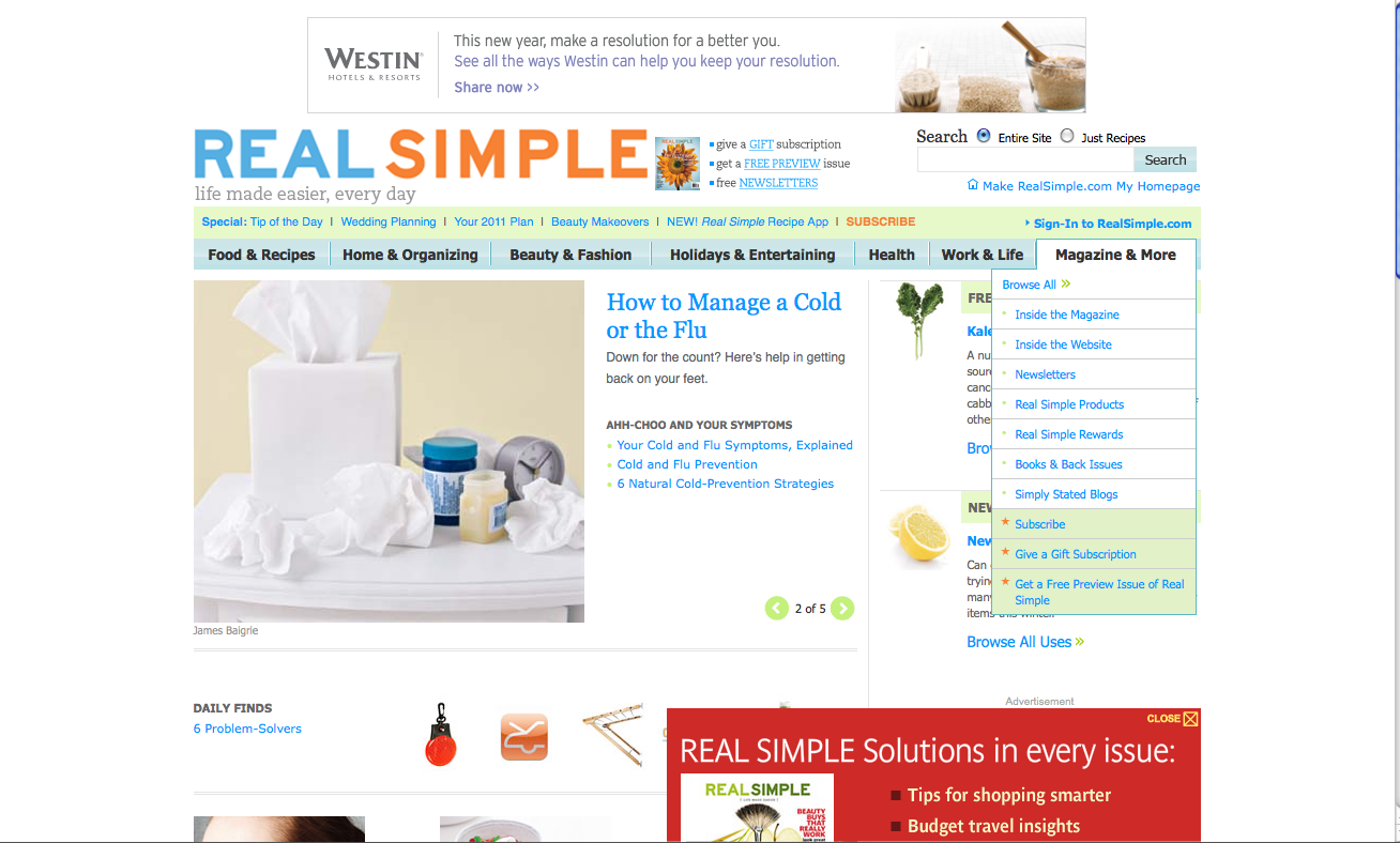
Screenshot of Real Simple website
This semester I have chosen to analyze Real Simple magazine's print publication and web platform. For the next few months I will purchase the magazine and check the site to monitor changes and find interesting multimedia elements. I feel that this magazine has a lot to offer on both sides.
On Real Simple's site they have a tab that gives an overview of the site and a tab that gives an overview of the publication. I plan to pay special attention to these areas of the site every week to see how often a monthly publication switches up their web content. The screen shot above is of their Web Site, and shows the tabs I mentioned.
I hope to find out pertinent information this semester about social media strategies implemented by this publication and how Real Simple is adapting to such a web-centric world.
Subscribe to:
Comments (Atom)